 This is an example of a picture that I rejected and decided not to use. I made this decision as the image looks too formal and would not be attractive to Sixth Form students. The image I should choose should be more relaxed than this, as it views students working.
These are rejected shots I took for the student magazine. I decided not to use them because the lighting was too dark. Also, the main object of the photo is the two students, and they have their backs to the camera. These would not attract readers to the magazine as they are not very eye catching or inviting to the reader.

This is an example of one of the pictures I am considering using for my student magazine cover. It shows a student taking part in a hobby (photography) which may attract readers that are interested in that subject. The model is using direct mode of address, this invites the audience in as it is as if the model is looking directly at the reader. Also, it has other students using 'mac' computers in the background, this may attract students to read the magazine as they are very high quality facilities. However, there is too much going on in the background of the picture, and this could distract the viewer from the main focus. Also, the lighting of the image could be improved as it is slightly dark. The model in the image is too close to the edge of the photo which makes it seem like it is not the main focus of the photo.
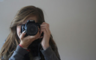
 Here is another photograph I took which is similar to the one above, however there is a plain background. This makes sure that the model is the main focus of the image as there is nothing distracting in the background. It also allows room for contents and title on the front page of the magazine and again, attracts readers that have an interest in photography.

No comments:
Post a Comment