Sunday, 17 October 2010

Monday, 11 October 2010

School Magazine Questionnaire

I created a questionnaire and handed it out to 10 people of my own age and students in my school year, ensuring that anyone answering it was between the ages of 16 and 18, and took a note of the results.

1) How often do you read magazines each month?
      a) Very Rarely
      b) Once or Twice
      c) Three times or more

2) What type of entertainment magazines do you read?
      a) Fashion
      b) Celebrity
      c) Music
      d) Sport
      e) Other

3) Would you regularly read a student magazine if it was available?
      a) Yes
      b) No

4) What type of organisation do you attend?
      a) None
      b) Sixth Form
      c) College
      d) Other

5) What information would attract you to reading a student magazine?
      a) Educational
      b) Events/Social
      c) Trips
      d) Oppurtunities

6) What are your main interests?
      a) Studying
      b) Media - films, TV, music etc
      c) Fashion

7) What do you think is the most important aspect of life at Sixth Form or College?
      a) Social
      b) Education
      c) University/Careers advice

8) State, in order of preference, which of the following you prefer in magazines.
      a) Images
      b) Lengthy articles
      c) Short articles
      d) Interviews

9) What is your favourite subject at Sixth Form or College?
      ____________________________

10) Please state anything else you like or dislike about magazines in general.
      ____________________________________________________________
      ____________________________________________________________
      ____________________________________________________________


Results


Thursday, 7 October 2010

Flat Plans for my magazine cover

The purpose of a Flat Plan is to design and layout a magazine cover showing positioning and colouring to make sure the target audience would want to read it. I created flat plan templates for the design of my magazine cover and interviewed my focus group to find out which one they preferred and if they had any comments on how the designs could be improved.


I asked my focus group to take a vote on which of the three above Flat Plans they preferred and these were the results:


I agreed with two of the four people in my focus group, that Flat Plan 1 looked the best.
Comments made on Flat Plan 1:
- "I prefer Flat Plan 1 as it keeps to the conventional style of magazines of its type and it is easy to read, which keeps the readers attention on the magazine."
- "The title of the magazine needs to stand out, if it is noticeable and bold it will catch the readers' eye."
- "I don't think the title of the magazine should just be set at the top, if it was at an angle, or in a font and colour that stood out, it would attract more student readers."

Taking the comments made by my focus group into consideration, I have created a final Flat Plan that I will use to create my magazine:

Wednesday, 6 October 2010

Focus Group

Alice Donovan
Age: 17
Studying: Philosophy/Psychology/English Language
Favourite Lesson: Psychology
Media Consumption: iPod/Laptop/Music channels/Blogs(tumblr)/TV - 3-5hours per day
Favourite Films: 500 Days of Summer/Anchorman
Hobbies/Interests: Music/Reading/Blogging
Dislikes Magazines: Too many repetitive adverts
Magazines they read: Look/Kerrang!/Vogue


Amelia Antill

Age: 17
Studying: Maths/Biology/Chemistry/German
Favourite Lesson: Biology
Favourite Film: Harry Potter/
Media Consumption: iPod/iTunes/Laptop/
Magazines/Newspapers/TV - 1-2hours per day
Hobbies/Interests: Guitar/Music/Reading
Dislikes Magazines: Too many adverts
Magazines they read:


Harriet Trayling

Age: 16
Studying: Media/French/English Literature/Sociology
Favourite Lesson: Sociology
Favourite Film: Mean Girls
Media Consumption:Internet/iPod/Phone/TV - 2 hours of TV each day
Hobbies/Interests: Music/Fashion
Dislikes Magazines: Boring articles
Magazines they read: NME/Look

Pictures for magazine cover

This is an example of a picture that I rejected and decided not to use. I made this decision as the image looks too formal and would not be attractive to Sixth Form students. The image I should choose should be more relaxed than this, as it views students working.



These are rejected shots I took for the student magazine. I decided not to use them because the lighting was too dark. Also, the main object of the photo is the two students, and they have their backs to the camera. These would not attract readers to the magazine as they are not very eye catching or inviting to the reader.


This is an example of one of the pictures I am considering using for my student magazine cover. It shows a student taking part in a hobby (photography) which may attract readers that are interested in that subject. The model is using direct mode of address, this invites the audience in as it is as if the model is looking directly at the reader. Also, it has other students using 'mac' computers in the background, this may attract students to read the magazine as they are very high quality facilities. However, there is too much going on in the background of the picture, and this could distract the viewer from the main focus. Also, the lighting of the image could be improved as it is slightly dark. The model in the image is too close to the edge of the photo which makes it seem like it is not the main focus of the photo.


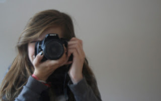
Here is another photograph I took which is similar to the one above, however there is a plain background. This makes sure that the model is the main focus of the image as there is nothing distracting in the background. It also allows room for contents and title on the front page of the magazine and again, attracts readers that have an interest in photography.